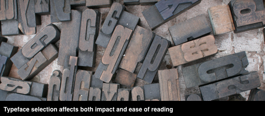
Thoughtful design decisions can make your proposals look professional and easy for evaluators to read and score. This post provides guidance for selecting and using a body type style. Rule 1: RFP requirements trump our advice.
Choosing fonts
Unless you’re a professional designer, stick with two fonts—one for body text, and a second for heads and subheads. You can find recommended font pairings on the web. Remember, the goal is a professional-looking, easy to read proposal. When deciding on type consider the following:
- User availability: Use typefaces included in the standard Microsoft font suite.
- Size and readability: Type is measured in points. A point is one-seventy second of an inch, a throwback to the days when type was set in hot lead. An “x” in 10-point type is 10 points in height. While larger type is generally easier to read, readability at a given size varies greatly among typefaces
- Serif vs sans serif: Serifs are small projections or “tails” on the ends of letter strokes. Serif typefaces are easier to read than sans serif, which is why most books, newspapers and magazines use serif fonts. That said, most teams use sans serif fonts. Calibri 10, 11 or 12 is a common choice for body copy. Arial narrow is a common choice for page limited proposals. Heads are often set in Helvetica or Futura
- Colour: Use black for body copy.
Setting up Word styles
MS Word provides many font and paragraph setting options. Choose settings before kickoff—especially if you plan to manage sections as separate documents to completion. Aligning styles on multiple clones of a template is painful.
- Language: Specify the language for Word’s built in spell-checker
- Line spacing: Increased line spacing helps readers quickly move from one line to the next. If a template column is more than 40 characters wide in your selected font, increase line spacing to at least 1.15 for readability
- Paragraph spacing: Do not use extra returns to space paragraphs. Instead, specify before and after paragraph spacing in points. We typically use 3 point and 6 point, so headlines can sit close to the paragraph below.
- Justification: Resist any temptation use fully justified body text (right and left edges align). Instead, set all text flush left. Flush left (also called left justified) text is easier to read, avoids uneven word spacing, and is more visually appealing on the page. (This post is set flush left)
- Widow/Orphan control: Turn on to avoid having a single line of a paragraph at the top or bottom of a page
- Set first line indent (if used)
Achieving emphasis
Use bold to achieve emphasis in body copy. Italics are hard to read and should be used sparingly. Underlining is a throwback to the days of manual typewriters, looks dated and is hard to read. Use emphasis sparingly. Overuse of emphasis equals no emphasis.
Do not base style names on Normal
By default, MS Word bases new styles on “Normal”, which is what you get when you open Word and start typing. Since Normal may have different settings on different machines, style issues can arise when copying and pasting copy created on multiple machines.
To avoid this vulnerability, create a new body text style based on “No style,” and then base bulleted and numbered lists, table, etc. styles, etc. on the new body text style.
The payoff
An hour or so spent choosing fonts, and then thinking through style setting decisions, will save time and frustration during editing cycles and when aligning multiple documents prior to submission.


