Recent posts have focussed on success factors for proposal narratives—including compliance, showing insight into the prospect’s needs and project requirements, and positioning your solution and team against competitors’ offerings.
This last post in our series explains why and how to use visualization to maximize narrative section scores.
Why visualize?
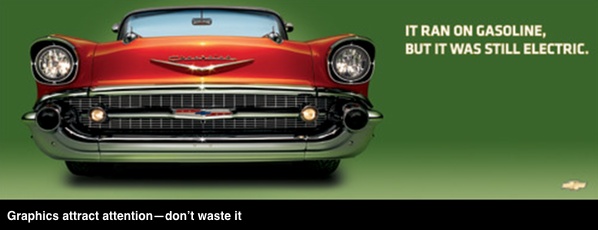
Many proposal teams sprinkle un-captioned photos, charts, graphs and screen grabs across pages as an afterthought to make their proposals look more inviting. Using graphics in this way is decoration, not visualization—and misses powerful opportunities.
Because graphics have great power to attract attention, use them tp communicate differentiators and to explain complex information to evaluators. Most evaluators scan and score proposals quickly and can miss scorable items buried in paragraphs of text.
See the sections below for effective ways to use visualization.
Visualize to differentiate
Visualize differentiators—features and benefits of your offer that are important to the prospect, and that your competitors cannot claim.
At a minimum, use a callout to draw attention to each differentiator (below left). For added impact, combine callout text with a graphic (below right).

Visualize to explain
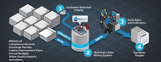
Use illustrations to show important concepts, designs, structures (such as networks), processes, etc. Do this whenever an illustration will improve or accelerate understanding and can be used to reinforce your compliance or advantage.
Graphics do not need to be elaborate to be effective, as the example below shows.

Visualize for efficient evaluation
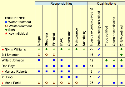
Since evaluators tend to skim proposals, look for ways to satisfy requirements visually. For example, instead of using text to meet a requirement to identify key individuals and their qualifications and experience, consider using a meatball chart, as illustrated below.

Caption visuals
Evaluators are unlikely to spend more than five or six seconds trying to make sense of a graphic. But, having been drawn to the graphic, most will read its caption. For this reason, include a caption with each graphic to express the message you want to convey.
To illustrate, either of the two examples below could be used to caption a photo of a safety meeting. Example A merely labels the photo, while example B conveys a valuable message about your safety record.

- A: Safety Meeting
- B: Safety Program Reduces Accident Risk: Our comprehensive safety program, including daily safety meetings at each site, has contributed to zero lost time accidents in the past 12 months.
Reusing visuals
For most teams, developing a graphic is not a one-time investment. Differentiators, processes, etc. tend to be durable. This means the related graphics, perhaps with some modification, can often be reused in future proposals.
Bottom line: Consistent use of visualization to convey valuable information is helpful to proposal evaluators and trains them to pay attention to your graphics and their captions/They will reward your efforts with higher scores.


