Recently we’ve focused on the benefits of standardizing proposal content. Standardized content can improve both quality and efficiency.
Standardization is not an invitation to simply cut-and-paste content. Every proposal still needs to show you understand the prospect and the project; that you have a solution that addresses the requirements—and that your team can execute.
The three posts on this topic covered:
- Benefits of standardized content
- Standardizing resumes and project sheets
- Standardizing plans and approach sections
This week’s post looks at standardizing graphic elements. Many proposals employ graphics (mainly photos) as decoration or to fill otherwise empty space. In fact, because evaluators are drawn to strong visuals and read captions, it makes sense to visualize your most important messages.
Here are some examples.
Show responsiveness
Use a table to show you understand and will respond to the prospect’s strategic drivers and hot button issues. Populate the requirements column from the RFP and your knowledge of the prospect’s hot button issues, and the proof column from how your response will satisfy each item. Consider using this format as part of your executive summary.

Show your process
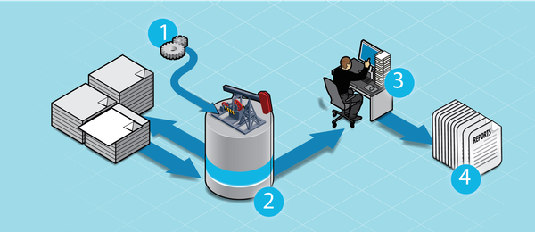
Visualize your process with a high-level illustration. Use the caption to stress advantages (e.g. time to market, reliability, risk reduction, etc.). A graphic artist can develop a diagram like the one below for about $200, and you can use it many times. When commissioning the graphic, plan to put project-specific detail in the caption, not in the graphic itself to make reuse easier.
Make your solution easy to understand
Use a structure (see below) to walk evaluators through your proposed solution. Keep the description high-level, using one or two sentences or bullet points for each cell, to help non-technical evaluators can understand it. If the RFP requires a detailed solution description, expand the cell contents—or put the detailed version in an appendix so you don’t lose the attention of senior-level reviewers.

Make comparisons
Use a table to ghost other vendors’ weaknesses. This demonstrates an understanding of key success factors while positioning your team against competitors. You can use a similar format to compare technologies, approaches or other aspects of your response and to differentiate your team and solution from your competitors.

Caption your graphics
Be sure to include captions with graphics—don’t leave it to the evaluators to figure out your intended message. Use the caption to connect a standardized graphic to the specifics of the prospect and RFP project.
Develop standards and build a library
Graphic standards make it easier to re-purpose graphics. Select a small colour palette compatible with your company’s logo or word mark and decide on other style components (e.g. line weights and a label font) for use in all graphics.
Build a graphics library on your shared server to enable proposal teams to easily find artwork from previous proposals.
Work smart. Win more.
Standardization—whether in written content or graphics—offers high returns for the thinking and designer costs involved. Professional-looking graphics and structured formats will reduce proposal development effort while increasing evaluator engagement and success rates.


