To maximize success set up proposal documents for easy reading. A recent post covered choosing a proposal body type style. This post looks at setting up and managing proposal headings.
Heads and subheads provide structure, guiding readers through the proposal. This is critical to scoring, given the typical proposal evaluator’s short attention span.
Use a consistent theme for heads and subheads
- Choose a font family that is readable in standard and bold faces and multiple sizes. Helvetica, Futura and Franklin Condensed (see below) are often used for proposal heads.
![]()
- Select one or two colours that are strong enough to be legible in small type and that will photocopy well in black and white. Good options are your company colours, or colours from the prospect’s logo or website.
- Avoid using reverse type, screens, gradients and other devices. These are distracting and may not print or photocopy well.
- Avoid all caps. All caps text is harder to read than upper and lower case and should be used (if at all) for main section heads.
- Don’t base styles on Normal. See the section on this in our post on Proposal body style.
- Set line spacing: Good design spaces headings close the paragraphs they introduce, rather than having them float between paragraphs. Use Word’s “space before and after” paragraph settings to do this. For 10- to 12-point type, 9 above and 3 below is a good combination.
- Set headings to move with the paragraph below. Check the “Keep with next” box in Word’s paragraph settings to avoid leaving a heading stranded at the bottom of a page.
Writing heads and subheads
Follow these guidelines when setting up heads and subheads:
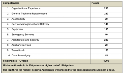
- Mirror the RFP: Align your ATOC and headings with the RFP scoring structure (see example in table below). Write and number heads and subheads to mirror any breakdown of rated requirements provided, using Word’s built-in multi-level list function.

- Limit choices: Creating many more heading styles than needed often results in authors becoming confused about which style to use. Instead, create two or three levels and name them accordingly (e.g. Subhead1, Subhead2, Subhead3)
- Use unnumbered subheads to break up text: Avoid large blocks of text that less engaged evaluators may skip. Instead, use minor or run-in heads to introduce scorable elements.
- Message where possible: When writing subheads to break up text within RFP-defined subsections, avoid simple labels in favour of benefits-oriented messaging. For example, version B below is preferable to version A.
A: Warranty terms
B: Comprehensive 5-year warranty
Remember the goal
Headings and subheadings should work together as an effective wayfinding system for evaluators. Make font, colour and settings decisions with this aim in mind.


